Tuesday 19 March 2013

Album Promotion

Itunes Promotion


Store Promotion


Digipak Construction Process


I chose to change the layout format of the digipak to include a circular CD shape giving me an accurate template to work on. I found this on the same website as I previously used. So far, in terms of the construction of my template, I have included the front and back cover.

To create the featured wooded shots to be placed behind the CD, I used the crop tool on a selected area of a photograph using the programme Photoshop. I then used the transform tool to adapt the size of my image to fit the template.


For the image on the inside left cover of the digipak, I want to include a simplistic location shot suiting the country genre. However the bright and sunny tone of the unedited picture did not suit the mood of the digipak. Which should in fact represent the personal heartbreak of the model? I experimented changing the levels on the image, reducing the saturation makes the image black and white.
 
 
 I then attempted using the opposite effect to black and white by greatly increasing the levels and curves making the image brighter. I do not like this effect as much as the black and white.


 After making the choice to use the location shot in black and white, I selected and transformed the photograph to fit it in with the layout structure of the digipak. I now have a foundation construction of the creation of the digipak to be improved upon.


To continue the house style throughout my digipak, I decided to use the same font as the rest of the text on the fold line. I then, again used drop shadow on blending options to enhance the boldness of the text.

 
I also used the brush tool "sparkles" to continue the effect throughout my digipak. The brush stroke stands out really well against the burgundy box colour.
 
 
 I then began to work on the CDs themselves. I wanted to continue the use of black and white to make sure all aspects of the digipak linked with each other. I used a photograph from my photo shoot and used the crop tool to select just the eyes. I then changed the saturation alike my previous image to create a black and white effect.
 
 
I now had to find a way of fitting the eyes onto the CD template. In my first attempt, I used the polygon lasso tool to cut round the edge of the image on the template. Then I used the blur tool to make the edges even.

Monday 18 March 2013

Filming #6

FILMING OPPORTUNITIES BEFORE THE DEADLINE ON FRIDAY!!!


The weather conditions on the days Wednesday, Thursday and Friday are all good for filming. Bearing in mind the deadline is Friday, I have booked out a video camera for Wednesday night to give me the time on Thursday during and after college to edit clips onto my music video.

Below is the final plan of the shots I need to capture in order to complete my music video.


  • 1:21 - 1:24 seconds - High angle shot of the female model with her eyes closing.
Medium shot of the model looking up into the camera.

  • 2:50 - 2:51 seconds - Medium shot of the female model.
Model shaking her head in the woods location.

Draft 3 of my Music Video

I am very happy with the changes made to my music video from my previous draft a few days ago. I have added many effects using the video transitions tool on the editing machine such as...............
I have outlined the three differernt shots I need to get from filming to complete my music video. This shouldnt take alot of time to obtain however I need to consider the amount of time it will take to then put together the finishing touches for my music video before the deadline on Friday.
 

Saturday 16 March 2013

Technical Process on the Editing Machine

(The following explanations and snap shots explain the process of super-imposition; this was basically a practice run. For my actual music video I used a medium shot of the male and female model together to reinforce the theme of love between the couple)
To reinforce the narrative of music video in the opening sequence, I planned to super impose an image on top of a clip of model staring into the mirror. This reflective shot gives the audience a personal view of the emotion the audience is feeling.
 

To do this, firstly I had to select the single section of the clip I wanted to extract the image from. This is the image I would alter to then impose on top of a clip. I saved the long shot of the model staring into the mirror as a TIFF file by selecting the file option, then export. I also had to do this process in selecting the image of the male model.


Luckily, the editing suite also had the Adobe Photoshop programme downloaded, meaning all I had to do was open both TIFF files on Photoshop. In order the place the males face into the mirror, I had to alter the size of the image.


To do this I selected file, transform, and scale. By holding the shift key simultaneously to decreasing the image size the picture did not become distorted.

Once I repositioned the image onto the mirror, I then had to make the outside edge of the image less prominent and more "dream like".


Next, I used the blur tool to drag the mouse around the edge of the image of the male model in softening the edges.
 
 After I was happy with my final image, I saved the file as a PMG. Then I went back onto Photoshop and imported the image onto my timeline. Then I simply had to position the clip on top of the previous motion clip.
 

Standard Billboard Poster Sizes


I found this website showing the standard billboard poster sizes. Having this information is useful as when I create my poster, the overall product should fit perfectly into photographs of bus shelters and iphone advertisements ect.

Further measurements are are also given. The website is
http://www.vinyl-banners.co.uk/billboard_poster_sizes.htm

Friday 15 March 2013

Draft 2 of my Music Video


I have been working hard editing my music video this week to ensure I had another draft to analyse for the weekend. I am happy I have met this personal deadline. There are few black areas in my video where footage needs to be placed. I do have the footage available on my shots selection on the editing machine, however I do feel that by re-shooting the quality of my work will improve and overall make my music video better. The video is basically a collective cut of all the shots put together so far. I still have plans for sections of my music video, for example the medium shot of the mirror at 19 seconds, where I am planning on merging an image of the male model. This will introduce the theme of love and heartbreak to the video. I also intend on using many dissolve transitions between the shots instead of the simple cut. I have followed certain aspect of my storyboard, certainly the start containing the mirror scenes. I need to focus on collecting more shots for the end of the music video, for example 3:15 onwards. So far I have found it difficult imagining  ideas for shots to use for this instrumental section as obviously the model cannot sing and i have used all of the narrative content planned. To overcome this problem I am going to seek advice off my teachers. 

Thursday 14 March 2013

Filming Shoot #5 - A small problem

After a mad rush trying to find a video camera that I could use for the afternoon and picking the model up from Hymers College we got to the location to find that it had started to snow! The weather is completely unpredictable at the moment so we had to simply had to wait in the car for it to stop. Thankfully, after 10 minutes or so the sun came out which was the perfect weather for filming.

Emergency Filming Shoot #5

This week there has been various weather conditions which mostly are not suitable for filming. Not only does rainy and cloudy weather not follow the sunny country genre of my video, but also I cannot risk taking the video camera outside in bad conditions. I have researched the best time to film this week using the BBC weather forecast and found I can either film today from 11am-3pm or Saturday 9am-12pm. In a last minute plan I have decided to film today as coincidentally the model is also free. This will hopefully allow me to collect all of the shots needed to complete my video. I will also book the camera out for Saturday in case extra filming is needed. I am aiming to complete my music video by Friday night giving me the final week to concentrate on my evaluation, audience feedback and completing creating my ancillary texts. 

Weather Forecast: 14/03/12


Weather Forecast: 16/03/12


Wednesday 13 March 2013

Process of creating the Digipak Back Cover

Synergy throughout my digipak can be viewed by the use of the distinctive location and natural tone. Therefore it is important the back cover also should be given the same effects as the main front image. This involves blurring the background image to make the model stand out. 
Firstly I recreated an exact replicate of the layer I was already working on; this meant that if for some reason the blur tool did not work with the image I still had a backup plan. 


To make the process quicker, I decided to use the polygon tool to crop around the image and isolate the model from the background image. The screen grab below shows the separation of the model to the image. I then used the Gaussian blur tool on the selection of 5.6 to then re-order the layers panel making the model prominant.


After the background image had been blurred, the next stage was to include text on either side of the model in proportional areas.


I then began to add in the names of the songs I wanted to feature on my music video. I already researched suitable song titles in the post "Research into different song titles". In previous drafts I intended on having these songs listed either side of the model, however now I am unsure as to the overall professional image. I used the font format "Vladmir Script" size 60pt in the colour white with a black drop shadow for the added touches of the text.


I then attempted to reposition the text to the left hand side of the album. This does appear to be more conventional when analysing existing digipak's however, in my opinion makes the rights hand side of the page look too empty.


I then used the website; http://www.barcodesinc.com/generator/index.php to create my own personalised barcode for my album. The print screen below is the first draft of my digipak back page after construction.

 
After this first draft, I recognised very important conventional features where missing. For example the image of the music label and a following website branded to the artist.

DIGIPAK ALBUM COVER


Tuesday 12 March 2013

Process of creating the Digipak Front Cover

I wanted to add sparkle effect around the border of my album front cover to connote the magic if the  music performed by the artist. I did this by creating my own brush tool named "sparkle" by mixing three different brushes together. (The process of creating this brush tool can be seen in the post "Star effect for Digipak", where i practised the effect).


It sounds very simple, but I found it very difficult using the crop button on the default Photoshop tool bar. The size of my photographs are standard so not suitable for the digipak therefore it was necessary my images were cut or cropped.


The main title of the album cover is the artists name "Brooklyn Wood". As you can see from the print screen, this draft is fairly basic and more work needs to be put into the title to make it stand out on the page. Also I need to add the name of the album.


I have experimented increasing the saturation on my image to make the red and orange colours brighter.

  
I also experimented adapting the main title to see if I could make it more eye catching and bold. The burgundy colour does compliment the costume of the model adding a bright tone to the dark background.


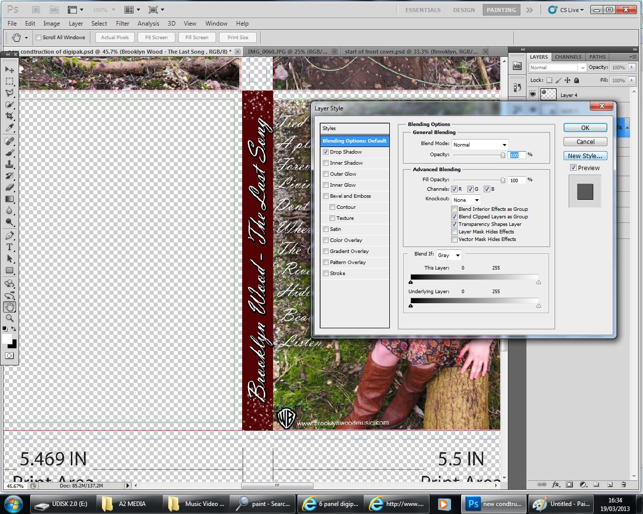
Here I decided the title of the album should be appropriately named "The last song". I used a alternate font to ensure the artists name stands out the most on the page. I am still unsure about the colour to use for my title.


The main reason why my text doesn't seem to look right on the page is likely to be because of the location of the photograph- the busy background. I had to remove the model from the background so I could use the blur tool; there are two different ways of doing this. I decided to try using the eraser tool first on one layer to then use Gaussian Blur on the background image.
The print screen below shows the rubbed out image of the model.


This shows the process of using the eraser tool (with the layer eyes turned on) to make the model stand out against the blurred background.

After I had finished editing the image, I moved the text layers at the top of the right hand side column, making the text viewable. In order to compare the appearance of the different font colours I decided I should add in the sparkles to witness the effect. The glittery sparkles compliment a white title.


This is the final construction of my CD cover.  


Sunday 10 March 2013

2 WEEKS UNTIL THE DEADLINE


These photographs demonstrate the process of creating my music video. It is very crucial I have this solid basis of my music video as it means the most important work has been completed. I do have 20 seconds still to fill however I know exactly what shots I need to film so I can quickly complete this in a short amount of time. Now I have finished filming i simply need to evaluate the whole video and assess which sections could be improved upon and reshot.


Monday 4 March 2013

Research into different Song Titles

It was very easy to find evidence of existing song titles following the country genre. I researched the criteria of various songs following the correct genre and found the following website very useful.

http://countrymusic.about.com/library/top500/ptop500.htm

This website basically provides 500 various and existing songs which are likely to have been advertised on digipaks. The songs I choose to advertise on my digipak must also have some link to the concept of love. The fundemental theme of the music video is heartbreak therefore it only makes sense that the rest of the album have relevance to this.

I have decided to promote 6 songs on the digipak. This even number will make the cover appear fairly proportional and not too busy.
I have chosen the following names for my chosen songs:


  • Living our love song
  • Tied together with a smile
  • Beautiful Soul 
  • A place in this world
  • The outside
  • Forever and always
  • Dont you remember
  • When I sleep
  • River in me
  • Hiding my heart
  • Listen

THE NAME OF THE ALBUM WILL BE THE LAST SONG.

Saturday 2 March 2013